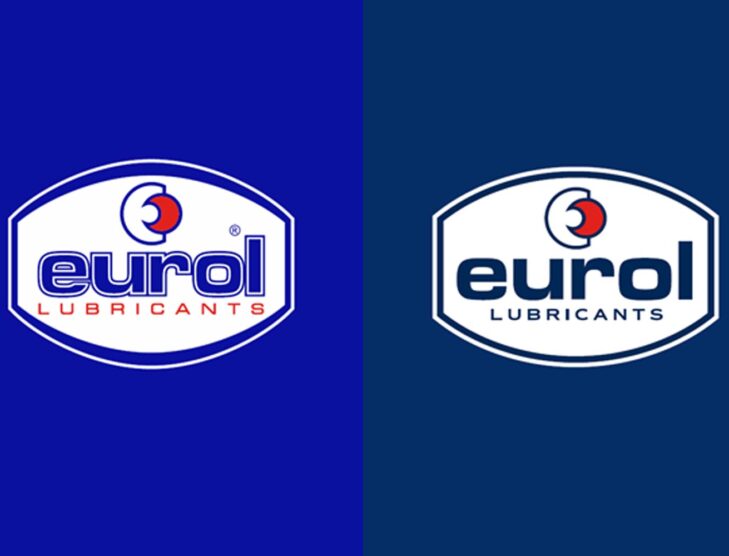
Eurol unveils new corporate identity


Eurol, a leading provider of high-quality lubricants and motor oils based in Nijverdal, The Netherlands, has unveiled a new corporate identity. The refreshed logo and brand identity reflect Eurol’s commitment to innovation and quality.
The new corporate identity will be introduced gradually. The phased transition means that the old and new house styles will temporarily be used side by side.
Eurol’s new logo is a modern interpretation of the company’s classic emblem. The updated brand mark features a cleaner, more minimalist design that represents Eurol’s core values of strength, trust, and reliability.
Eurol’s new corporate identity reflects the company’s evolution from a traditional oil producer to a forward-thinking supplier of high-tech lubricants and motor oils.
A new corporate identity comes with a refreshing logo, matching the DNA of Eurol. The Eurol logo has been subtly changed and refreshed without losing any of its recognizability. The readability of the logo has been improved. A darker shade of blue gives the logo more contrast.
The brand promise ‘Quality is in Our Nature’ has been changed to ‘Powering Performance’ in line with its ambitions. The pay-off Powering Performance is used next to the logo. This sentence communicates in a few words what Eurol stands for.
In addition, the Eurol Wave, colors and typography have been adapted. These are recognizable elements of the Eurol corporate identity.
Eurol’s new tagline, “Lubricants for life,” underscores the company’s dedication to providing products that protect and enhance the performance of engines and machinery.